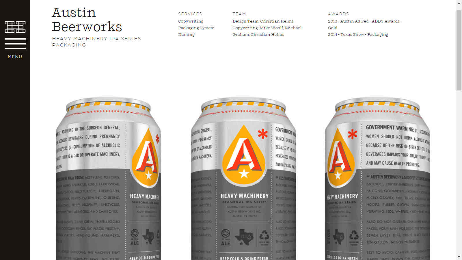
Flower
Bevlog

Posts Tagged ‘design’

Proof: Booze Makes the World More Colorful

buzz

For quite some time, I have noticed that alcohol beverage packaging tends to be prettier than lots of other packaging. Now, perhaps, I am on the verge of proving this hunch, though the manner of proof, in the form of a BuzzFeed article, may be a bit light on evidence.

The article shows the “34 Coolest Food Packaging Designs Of 2012.” Of this sampling, fully 20 are beverages. Of those, no less than 13 (more than a third) are alcohol beverages. Not bad, considering all the other categories represented, such as chocolate, cheese, jam, pasta, and bread.

Within the alcohol beverage category, I think the Slamsey’s Gin (as above) and Dancing Pines Bourbon bottles look good. I did not notice US approvals for those two, or most of the others on the list, so far. So this may be a harbinger that there is plenty of interesting work to look forward to in 2013. Of the products listed, Kraken Spiced Rum is the most familiar, and the US approval is here.

Tags:

Posted in:

alcohol beverages generally, distilled spirits specialty


Email This Post Email This Post     |    Print This Post Print This Post     |    


Trampy Beer and Wine, and a Vigorous Defense Thereof

Some of the Clown Shoes beer labels, such as Tramp Stamp and Lubrication, are leading to lots of controversy. This got us to reading about the graphic designer for both. While we reserve judgment about the labels at issue, the blog post by the label designer for Clown Shoes is so good and vigorous that we wanted to cover it here. The designer of the label on the left is Stacey George. She is based in Massachusetts, and she talks about the issues in a July 6, 2011 post entitled “Sometimes, a Pipe is Just a Pipe.”

“Are Clown Shoes’ labels offensive?” Sure. Why not? Offensive is a subjective term. If you look at the labels and find yourself offended, there you go. Do you have the right to say so? Abso-friggin-lutely! Shout it from the highest mountain, or your Twitter account, or your brothers’ website, whatever your bullhorn is, use it, loud and proud. Here, let me loan you a sandwich board and a bell, you can be offended Town-Crier style, I got your back.

My labels for Clown Shoes—which were named Best Craft Beer Art of 2011 by PourCurator.com—are not illustrated with a sexist intent. For instance, a Tramp Stamp is a tattoo placed on the lower back of a woman to emphasize her sexuality. In Germany, they call it, Arschgeweih, meaning, “Ass Antlers.” Can you imagine if we had named a beer Ass Antlers!? We have nicknames for these tattoos because they have a purpose. The woman who has one is confident in her sexuality and she is enticing the viewer to appreciate her. A woman who is comfortable in her own skin and likes how she looks is a sexy woman. Sexy is not sexist. In fact, sexist is rarely sexy.

As a woman, and an artist, I have a hard time with [the] images being labeled chauvinistic. Chauvinism is an attitude of superiority over the opposite sex. I’m not designing women who are inferior, I’m designing women who celebrate who they are. So, who is bringing the inferiority? The viewer? The offended? It’s a complicated question.

Stacey George probably did not design the wine label on the right. But while we are appreciating Stacey’s work, and thinking about tramps, we wanted to include at least one more tramp-related label. Stamp du Tramp is bottled by Greg & Greg, Inc. of Sebastopol, California.

Are Clown Shoes’ labels offensive?” Sure. Why not? Offensive is a subjective term. If you look at the labels and find yourself offended, there you go. Do you have the right to say so? Abso-friggin-lutely! Shout it from the highest mountain, or your Twitter account, or your brothers’ website, whatever your bullhorn is, use it, loud and proud. Here, let me loan you a sandwich board and a bell, you can be offended Town-Crier style, I got your back.

Tags:

,

Posted in:

malt beverage, wine


Email This Post Email This Post     |    Print This Post Print This Post     |    


Design Patents

I got to talking with Dan Matauch the other day. He is a leading package designer in Michigan, at Flowdesign. I would have been impressed enough that he handled the design for Honest Tea. But he also handled Peet’s Tea, and Xango (aka Tiger Blood), and most of the designs really appeal to me. The list goes on and on, with Catdaddy Carolina Moonshine, Blue Ice Vodka, and the not-to-be-ignored Bawls and Stubb’s.

I was fairly surprised to see that Dan worked on the package design for Pama Pomegranate Liqueur — and it had some kind of patent. The March 2010 press release says:

To differentiate its product, PAMA Spirits turned to the expertise of Flowdesign to develop a custom bottle that was both unique and could be patented. … Flowdesign is a unique branding firm where experience is infused in both brand graphics and structural design. Founded in 1997, Flowdesign has led the brand design field in custom structural design with 10 prestigious GPI (Glass Packaging Awards).

It surprised me because the conventional wisdom seems to be that it’s normal to get a trademark related to alcohol beverages — but it’s not realistic to get a patent. The conventional wisdom may be too simple. We have covered several alcohol beverage-related patents in the past, such as Malt Liquor, Cubes, and Fruity Caps. To understand this better, I talked with Paul Hletko. Paul is perfect to dissect this because he happens to be a patent lawyer — and runs Few Spirits (of Evanston, Illinois). Paul explained as follows:

The beverage alcohol business is exceptionally competitive.  Innovative companies are always trying to distinguish themselves to stand out from the competition, while others try to engage in “sincere flattery.”  Brands can go a long way by distinguishing themselves with distinctive and unique propositions, but this can attract copying.  After investing the time and money for uniqueness, it is rare that a brand welcomes a copycat.  Protecting against these problems can be expensive short term, but prove highly valuable long term. One of the first strategies to protect innovation is the use of trademarks.  However, trademarks are “usage” based and thus have certain advantages and disadvantages.  In particular, it can be difficult to gain traction with a new trademark. This short post is not intended to address trademarks – another topic for another day.

Another potential strategy is to seek patent protection for unique and nonfunctional designs.  In the beverage alcohol industry, this typically means unique bottle designs. For example, the PAMA brand secured design patent protection for a new bottle. D598,777 S claims this unique bottle shape, and gives its owner the exclusive right to make, use, or sell bottles with that design for the life of the patent.  Other designs could also qualify for design patents, such as a unique bar top (Blanton’s) or the like. A design patent covers the design of an object, so long as the design is not mandated by the function.  Additionally, the design must be novel as well as not obvious to one of ordinary skill in the art.  Unlike trademarks, however, design patents have a limited life span, and the patentee may be faced with questions about what to do after the patent expires.  But, so long at the design patent remains in force, the owner of the design patent has the exclusive right to make, use, or sell the design.

Unlike trademarks, design patents are based on registration, and prior to registration, the design patent application must be examined to ensure that the design is indeed novel, useful, and nonobvious.  Unfortunately, this can cost money, but the advantage of the exclusive right to make, use, or sell may justify the investment.  If your product is getting a new bottle or other design flourish, you should consider trying to protect the investment. By no means does this brief note apply to all situations, and it is not legal advice, but it should help you talk with your attorney – consult your attorney for guidance on how best to capitalize on your unique situation.

Thus, if one of your brand’s differentiating characteristics is a new bottle design or other similar packaging, consider and evaluate whether a design patent would be appropriate. Paul explained that the cost will likely be significantly lower than the investment in the new design itself (molds, designers, etc.) and the investment may prove highly valuable when the “flattery” starts.

Tags:

, , , ,

Posted in:

alcohol beverages generally


Email This Post Email This Post     |    Print This Post Print This Post     |    


Beer Label Design

Here is an experimental beer label, sent in from one of our favorite label designers. It is from Dave Bourne of Ignite Design in Portland, Oregon. Dave saw it at The Dieline and commented as follows:

You don’t need beer goggles to fall in love with this label design. Beyond the irreverent text and what seems to be their logo of an inebriated beer droplet, there is a design aesthetic that easily combines all the random graphic elements together as a cohesive unit. Who knew you could use no less than seven different typefaces and make them all work together in unison? It helps that all the graphics are gold on a simple off-white paper stock. Also, the placement of every design element fits within a grid-like structure that allows you to look at each component of the design within its own square or rectangular space.

While you’re throwing back a few of these, it’s clear that you won’t be bored with ubiquitous “Don’t drink and drive” statements or graphics of the various kinds of hops they’ve used. Instead, you’ll enjoy a little lesson in beer chemistry along with a few fireworks and an exclamation of “SWEET JESUS” possibly reminding you to pray for more of this beer when it runs out.

We blurred up some of the swear words, and you can see the unexpurgated version at the link. I like this design and would not resist buying the beer or drinking it, but I think Dave likes it more than I do. Where are the other great beer label designs and designers? What makes them great?

Tags:

Posted in:

malt beverage


Email This Post Email This Post     |    Print This Post Print This Post     |    


Book, Movie, Wine (or, Eat, Pray, Love & Drink)

First it was a major book. Then “A Major Motion Picture.” Now, “Eat, Pray, Love” is an Italian wine coming to a store near you. If the wine sells, too, who knows what will be next. The Wii game? EPL analgesics? I also wonder to what extent the success of this franchise is due to the power of good design and font choices; this would just not be the same in Times New Roman.

These wines, referring to the Elizabeth Gilbert book, are imported by Chateau Diana of Healdsburg, California.

Tags:

,

Posted in:

wine


Email This Post Email This Post     |    Print This Post Print This Post     |    


Search Bevlog


Subscribe to the RSS feed

Get bevlog via email.
Delivered by FeedBurner